Bar Graphs are easy to read and you can use them for categorical or numerical data. Categorical data is when the data is lumped into categories such as hair color, types of cars, etc. Numerical data is data that consists of numbers such as height, weight, etc. The bars in a bar graph should not touch.
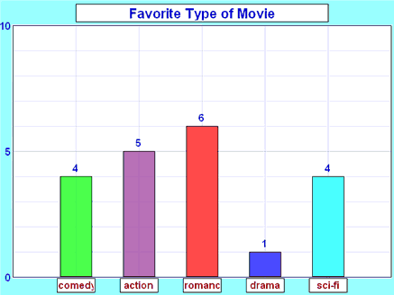
http://www.mathsisfun.com/data/bar-graphs.html
Pictograph works a lot like a bar graph and is useful for large sets of data. It must contain a legend/key. A downside to this type of graph is that it is easily to manipulate so you really need a reliable source for your data.

http://studyzone.org/testprep/math4/e/readpicto3p.cfm
Pie Charts are also called circle graphs. They are easy to compare data because all of the data is part of a whole. Fractions and percentages work well in circle graphs. They are rather difficult to make by hand but computers can easily help you out with this task. These work well for budgets.

http://my-alternate-life.com/the-budget-objective/
Histograms are very similar to a bar graph but the bars do touch each other. This is because their data is continuous. Order matters when making this graph. A negative to using this type of data display is that you can lose individual data.

http://www.chlt.org/StatisticalMethods/histograms.html
Stem and Leaf plots are for organizing data into a table. They are easy to create and read if there is a small amount of data. The larger the amount of data, the more difficult this type of data display gets. Some advantages to this type is that there is no lost data and it is easy to see groups or clusters. Unfortunately for this graph, you cannot tell whose data belongs to who.

http://www.eduplace.com/math/mhm/5/06a/
Line graph uses trends over time. Line graphs work well with a small data range. They are easy to read. You can compare two or more sets of data on the same graph.

http://spreadsheets.about.com/od/excelcharts/ss/line_graph.htm
Dot plots are easy to make by placing a dot on the graph in each category. They can be used similarly to a bar graph. You need to be very precise when making these otherwise they can be hard to read especially if your dots are not uniform in size.
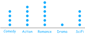
http://www.mathsisfun.com/data/dot-plots.html
Scatterplots can use large amounts of data and adjusted to scales. They give a correlation between sets of data. They can often be misleading.
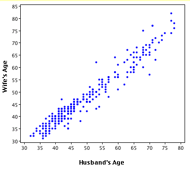
http://onlinestatbook.com/chapter4/intro.html
Frequency tables can hold lots of data and group it together making it simple to read. These work well in figuring out what is the most popular, for example if you own a shoe store and wanted to know what sizes you should order.
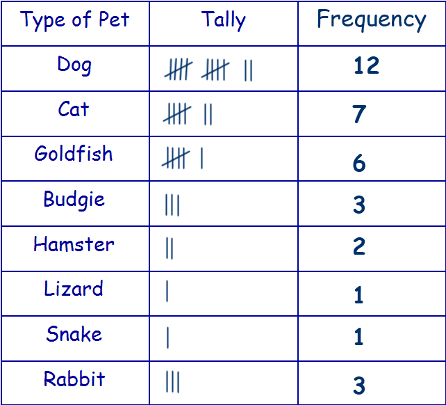
http://www.11plusforparents.co.uk/Maths/handling%20data.html
Hope this helps explain some of the different types of data displays or graphs.
I really enjoyed this post with all the different types of charts. It definitely shows you put a lot of work into it. I myself love using charts and I love the variety of charts you have shown. I was however a little confused about your frequency table. You had talked about a shoe store, and then to figure out what type of shoes to buy you could use a frequency table. I was hoping to see that the frequency table information to be about shoes, but I understand what you were getting at. That is something I would possibly change to maybe better clarify what you are wanting to show. Overall great post. Thanks for sharing.
ReplyDeleteWow, that was a great break down of all the charts we went over. You did an amazing job of explaining each one and the images were a perfect support to your information. This would be a great place to send children for a refresher after Spring Break. :)
ReplyDelete