Standard Deviation
The standard deviation is related to the mean (or average) of the set of data. The standard deviation will show a relationship to how the rest of your data stacked up to the mean, was it close to the mean or was it spread out all over the place.
To find the standard deviation, you must find the square root of the variance. The variance is the average of the squared differences from the mean.
Example: The class had the test scores of 71, 77,77,77,78,79,82,83,84,84,88, and you want to find the standard of deviation of these grades.
First, you must find the mean. So add them up and divide by the total number of items, which will give you 80 as your mean.
Next, you need to find the variance, which just means how far away from the mean is each number.
71-80=-9
77-80=-3
77-80=-3
77-80=-3
78-80=-2
79-80=-1
82-80=2
83-80=3
84-80=4
84-80=4
88-80=8
Now, take this differences and square them and then add them all together. Remember all the negative numbers will become positive when you square them.
-92+-32+-32+-32+-22+-12+22+32+42+42+82=222
Your next step is to divide this total by total number of scores which will give you your variance of 20.182.
To get the standard deviation, you take the square root of the variance. In this case it would be 4.5.
Standard deviation is divided into three groups.So in this example you would take your mean of 80 and subtract 4.5 from it and add 4.5 to it to get the range of the first standard deviation, which would be 75.5 to 84.5. This shows that the majority of students passed the test. The second standard of deviation which would include 95% of the students test scores would range from 71 to 89, just adding and subtracting the standard deviation amount to last numbers. The final third standard deviation would include 99.8% of the data and the test scores would range from 66.5 to 93.5.
Friday, February 21, 2014
Wednesday, February 19, 2014
MEAN, MEDIAN OR MODE
WHAT DO THESE CRAZY WORDS MEAN?
The mean is the average of a set of numbers. You use this a lot in sports such as batting averages, bowling scores, etc. Teachers will use this a lot to find the class average of a test score. To find the mean, you simply add up all the numbers in the set and divide the total by the number of items.
The median is the middle number when you line up the set from least to greatest. Remembering that the median is in the middle of the road may help you remember what to do for this number. To find the median, simply put the numbers in the set in order from least to greatest. Then cross off the first and last number, repeating this until you get to the middle number, which is your median. If you have an even number, you will have two numbers left. In this case, you add the two numbers together and divide by two to get your median.
Mode is just the number that occurs the most times in the set. To find the mode, put the numbers in order from least to greatest, and find the number that occurs the most. You can have two modes which is called bimodal.
Monday, February 17, 2014
Children are constantly being asked to create or read a graph or data display. Hopefully this will help you figure out when to use which type of graph and what each one should look like.
Bar Graphs are easy to read and you can use them for categorical or numerical data. Categorical data is when the data is lumped into categories such as hair color, types of cars, etc. Numerical data is data that consists of numbers such as height, weight, etc. The bars in a bar graph should not touch.
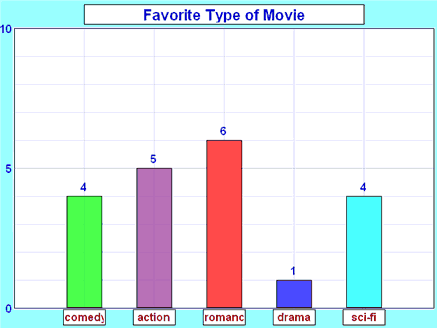
http://www.mathsisfun.com/data/bar-graphs.html
Pictograph works a lot like a bar graph and is useful for large sets of data. It must contain a legend/key. A downside to this type of graph is that it is easily to manipulate so you really need a reliable source for your data.

http://studyzone.org/testprep/math4/e/readpicto3p.cfm
Pie Charts are also called circle graphs. They are easy to compare data because all of the data is part of a whole. Fractions and percentages work well in circle graphs. They are rather difficult to make by hand but computers can easily help you out with this task. These work well for budgets.

http://my-alternate-life.com/the-budget-objective/
Histograms are very similar to a bar graph but the bars do touch each other. This is because their data is continuous. Order matters when making this graph. A negative to using this type of data display is that you can lose individual data.

http://www.chlt.org/StatisticalMethods/histograms.html
Stem and Leaf plots are for organizing data into a table. They are easy to create and read if there is a small amount of data. The larger the amount of data, the more difficult this type of data display gets. Some advantages to this type is that there is no lost data and it is easy to see groups or clusters. Unfortunately for this graph, you cannot tell whose data belongs to who.

http://www.eduplace.com/math/mhm/5/06a/
Line graph uses trends over time. Line graphs work well with a small data range. They are easy to read. You can compare two or more sets of data on the same graph.

http://spreadsheets.about.com/od/excelcharts/ss/line_graph.htm
Dot plots are easy to make by placing a dot on the graph in each category. They can be used similarly to a bar graph. You need to be very precise when making these otherwise they can be hard to read especially if your dots are not uniform in size.
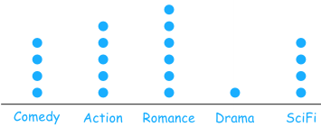
http://www.mathsisfun.com/data/dot-plots.html
Scatterplots can use large amounts of data and adjusted to scales. They give a correlation between sets of data. They can often be misleading.
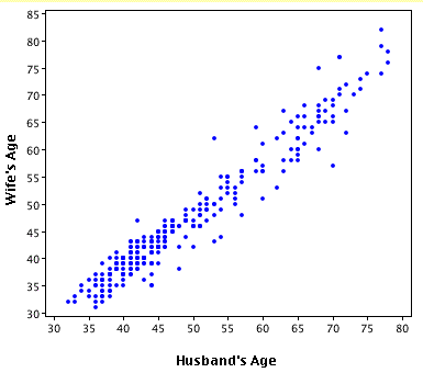
http://onlinestatbook.com/chapter4/intro.html
Frequency tables can hold lots of data and group it together making it simple to read. These work well in figuring out what is the most popular, for example if you own a shoe store and wanted to know what sizes you should order.
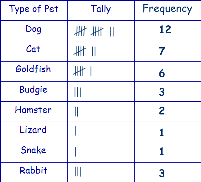
http://www.11plusforparents.co.uk/Maths/handling%20data.html
Hope this helps explain some of the different types of data displays or graphs.
Bar Graphs are easy to read and you can use them for categorical or numerical data. Categorical data is when the data is lumped into categories such as hair color, types of cars, etc. Numerical data is data that consists of numbers such as height, weight, etc. The bars in a bar graph should not touch.
http://www.mathsisfun.com/data/bar-graphs.html
Pictograph works a lot like a bar graph and is useful for large sets of data. It must contain a legend/key. A downside to this type of graph is that it is easily to manipulate so you really need a reliable source for your data.
http://studyzone.org/testprep/math4/e/readpicto3p.cfm
Pie Charts are also called circle graphs. They are easy to compare data because all of the data is part of a whole. Fractions and percentages work well in circle graphs. They are rather difficult to make by hand but computers can easily help you out with this task. These work well for budgets.
http://my-alternate-life.com/the-budget-objective/
Histograms are very similar to a bar graph but the bars do touch each other. This is because their data is continuous. Order matters when making this graph. A negative to using this type of data display is that you can lose individual data.
http://www.chlt.org/StatisticalMethods/histograms.html
Stem and Leaf plots are for organizing data into a table. They are easy to create and read if there is a small amount of data. The larger the amount of data, the more difficult this type of data display gets. Some advantages to this type is that there is no lost data and it is easy to see groups or clusters. Unfortunately for this graph, you cannot tell whose data belongs to who.
http://www.eduplace.com/math/mhm/5/06a/
Line graph uses trends over time. Line graphs work well with a small data range. They are easy to read. You can compare two or more sets of data on the same graph.
http://spreadsheets.about.com/od/excelcharts/ss/line_graph.htm
Dot plots are easy to make by placing a dot on the graph in each category. They can be used similarly to a bar graph. You need to be very precise when making these otherwise they can be hard to read especially if your dots are not uniform in size.
http://www.mathsisfun.com/data/dot-plots.html
Scatterplots can use large amounts of data and adjusted to scales. They give a correlation between sets of data. They can often be misleading.
http://onlinestatbook.com/chapter4/intro.html
Frequency tables can hold lots of data and group it together making it simple to read. These work well in figuring out what is the most popular, for example if you own a shoe store and wanted to know what sizes you should order.
http://www.11plusforparents.co.uk/Maths/handling%20data.html
Hope this helps explain some of the different types of data displays or graphs.
Wednesday, February 12, 2014
Bar Graph or Pie Chart
A bar graph uses rectangular shapes, horizontally or vertically, to represent the number of items in a category.
A pie chart will divide a circle to represent the number of items in a category.
There is an easy way to turn a bar graph into pie chart by cutting the bars off the graph and taping them together to create a circle. Use the circle to draw your pie chart and color code it exactly as the bar graph is colored. This is a simple and useful tool to show students that they represent the same statistic just displayed differently.
Friday, February 7, 2014
Probability Vs Odds
The probability of an event happening is equal to the number of successful outcomes over the total number of outcomes. So when rolling a die, the probability of rolling a 3 is 1/6. Since there is only one successful outcome out of six possibilities.
The odds of an event happening is equal to the number of successful outcomes over the number of failed outcomes. The odds in favor of rolling a 3 on a die is 1:5 because there is one successful outcome and five outcomes that will be a failure to roll a 3. Odds will always add up to the total number of outcomes in the probability. The odds against rolling a 3 would be 5:1 since there are five successful ways not to roll a 3 and one failure, which would be to roll a 3.
Thursday, January 23, 2014
Creating this blog made me feel like a moron, so of course I enlisted the help of my 6th grader to show me what to do. Thank God I didn't need my kindergartner's help. When I came home today and told my kids that I played Rock, Paper, Scissors in class today, my 6th grader stated "That's not fair. That's it! I am becoming a teacher, you are having too much fun in these classes."
So in case you are wondering why we played Rock, Paper, Scissors we were dealing with a chapter on Probability. We played 45 games to see what the outcomes of the game were. I was partnered with Jayme. We found that I won 17 times, Jayme won 16 times and we tied 12 times. That makes our probabilities as follows. The probability of me winning, which is written P(Bridgett wins) = 17/45. The P(Jayme wins)=16/45 and the P(tie)=12/45.
We also explored the difference between experimental probabilities and theoretical probabilities. Experimental probabilities are the actual experiment of us playing the game. The theoretical probabilities only focus on what outcomes could possibly happen. The two, for the most part, should be pretty similar but sometimes the experimental probabilities can be vastly different. This is because humans are playing the game and try to use a strategy to outwit their opponent. The theoretical probability states that I should have one 1/3 of the time, Jayme should have one 1/3 of the time and we should have tied 1/3 of the time. Making our numbers of wins and ties all being 15. Since ours were pretty close, we concluded that Rock, Paper, Scissors is a fair game because everyone had a pretty equal chance of winning.
Subscribe to:
Posts (Atom)